Does this map look similar to you or stack at your organization?
This illustration is built on top of my last post: Data Polymorphism. In that blog, the U shaped computer to computer flow describes an end to end digital transaction and various format of data. Here, rather than expanding on data polymorphism, I listed technologies or brands of service. Each is placed next to the proximate positions through the data process. This is not intend to be a complete list.
If you are a chief technologist, or a leader in infrastructure and integration, you are dealing with this crowd. You might be tasked to paste the puzzles together with pieces of technology, acquisition, service level agreement, workforce skills, and forward-looking replacement. You might be happy with your current providers’ price and performance; or you might be locked-in to some degree, having difficulties on licensing negotiation, missing resources, end of life/end of support of things, or need a vision for modernization. You should start from a simple illustration like this and explore future options. This is the map of your infrastructure ecosystem.
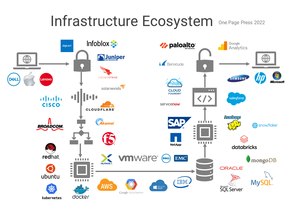
Please ask yourself some simple questions. Do you want to continue with this harmonic symphony structure, or do you want to a smaller crowd with more streamlined tools and services? How much cloud you want to come into play? Do you prefer managed services over full infrastructure control? What’s your budget and timeline? Those are decision matter questions. In the next post, I will share the same ecosystem with a cloud native approach, using AWS as example. You can achieve the same goal with other cloud providers as well, or in a hybrid, multi-cloud architecture.
