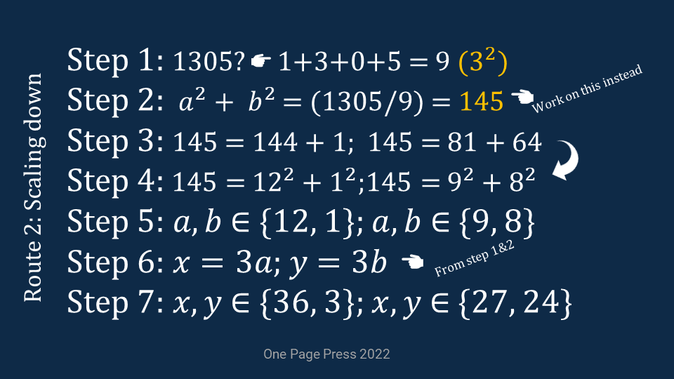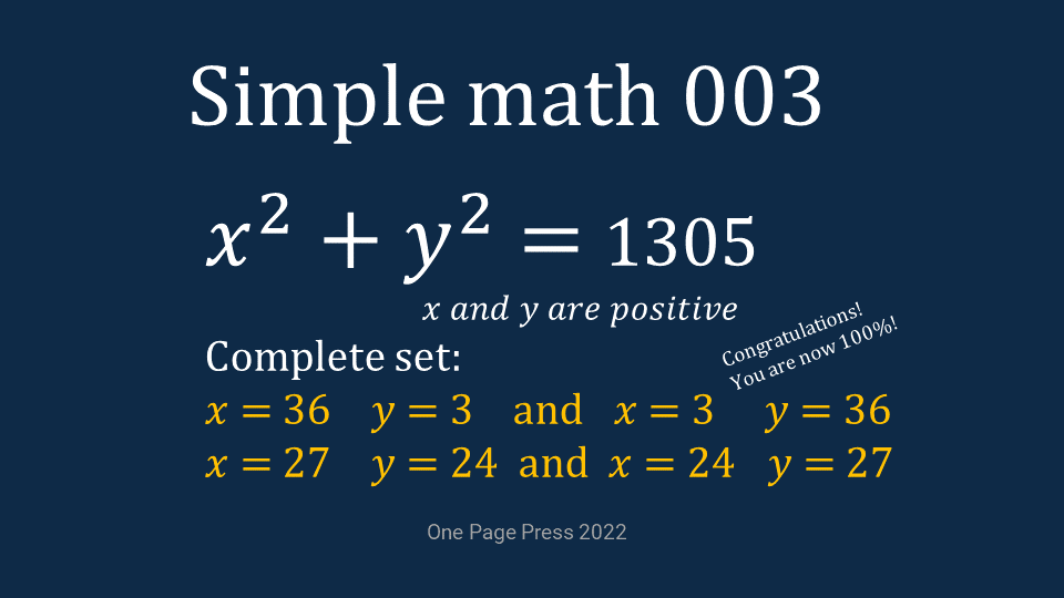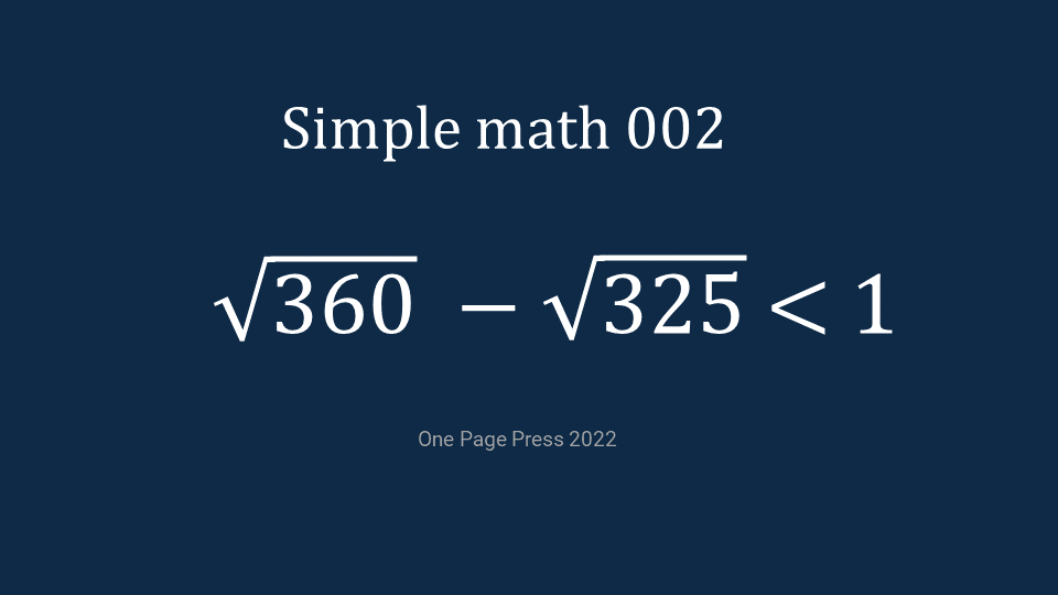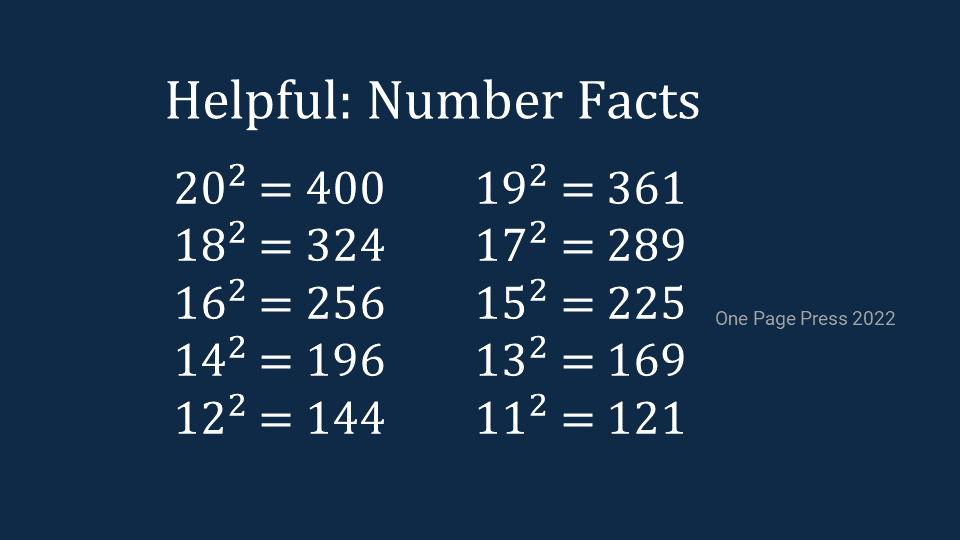

Cloud cost as an example, this can be applied to any finance. This is about turning a list of SKUs or a long spreadsheet into something better organized with more visualization. In many occasions, a leadership decision is not based on decimal details, but percentage, relativity, comparison, composition, or other coarse grained information.
I pulled a project’s monthly cloud cost from AWS. I first grouped the cost based on their technology purpose, this step can be automated and customized based on your specific need. You will have to decide a zero cost a show or no show on each type of picture.
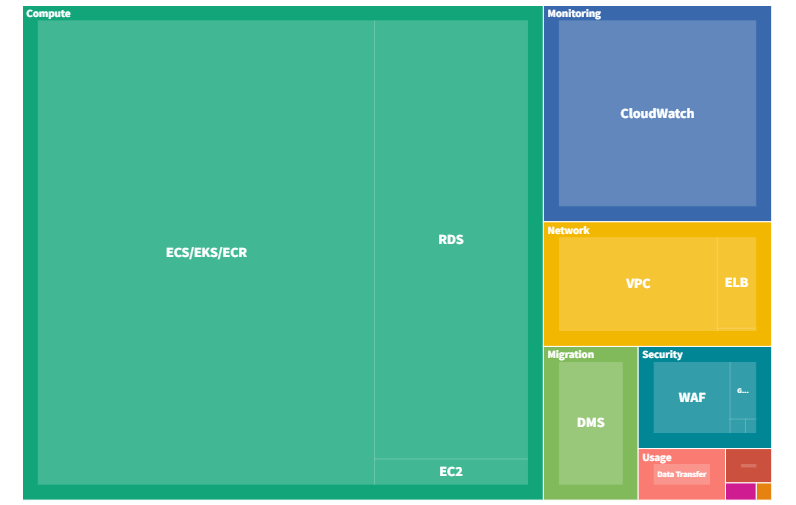
Block view: This is probably the most effective general purpose visualization. Different parts are depicted in territory size, therefore, it is best for grasp the overall picture. It also gives strong contrast on ranking and comparison.
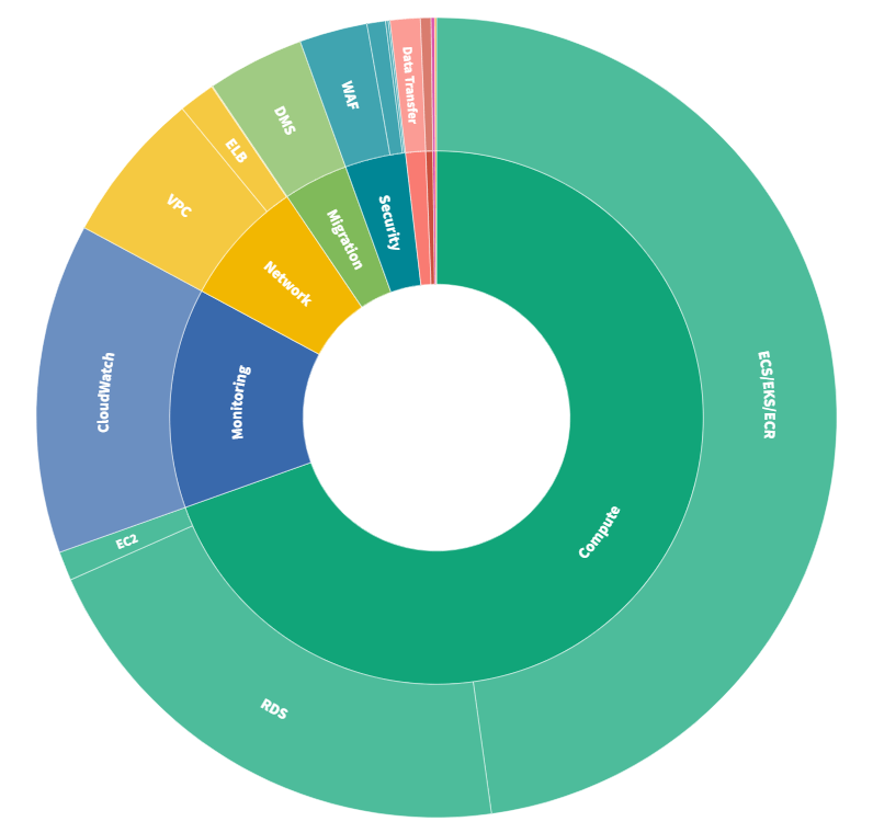
Donut view: Donut view can be difficult to view if there are many smaller percentage items. The char becomes too busy, and labels are harder to read.
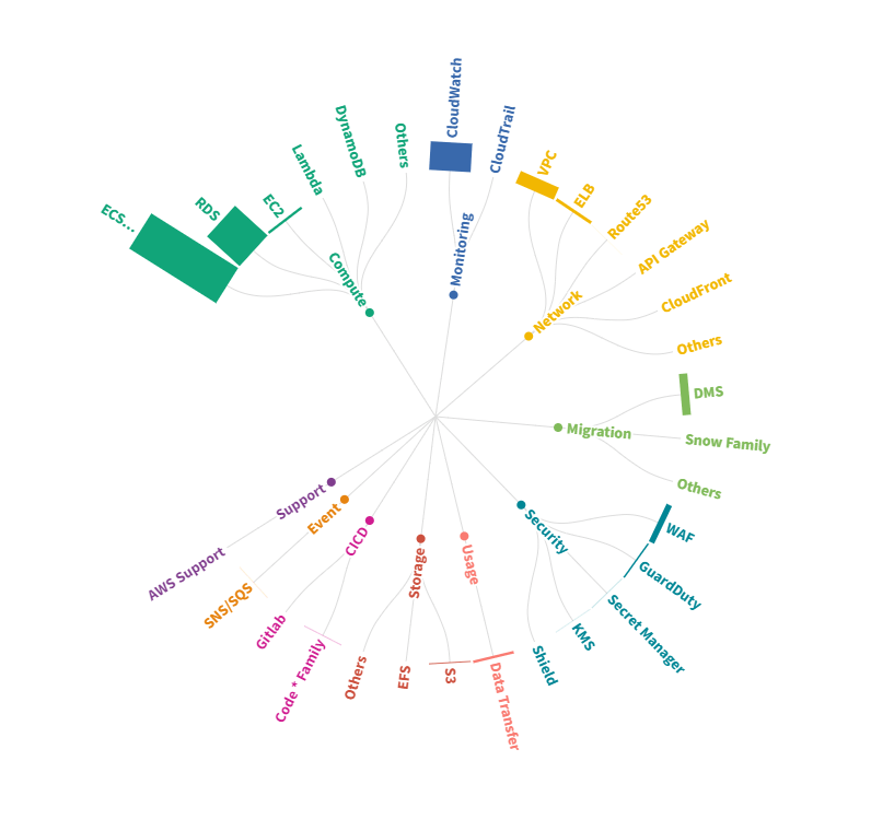
Planet view: This is best for relative sizing, and focus on top ranked items. It is similar as we list planets from our solar system by their size. This is great if you don’t want to review all the items, but just a few of them.
Spike view: This is my favorite. Number one, it lists all items, and give every item an equal space on a wheel, and good for you to see those zero cost items. Number two, as the name speak, the spike on top ranked items are stunning and hard to miss. That spike is particularly useful for abnormally detection. Lastly spike view is best for composition view, or category memberships, since other views focus on value.
Block, donut and planet are value based, good for sizing, ranking, and top ones. Spike is member based, good for total accountable, abnormally, however, limited with its spoke space, it is hard to differentiate if you have some similar valued top items.
Hope you find your favorite chart, for the best use on the occasion.