Data Visualization
What it is?
Data visualization is the process of taking data and transforming it into graphical representations such as charts, graphs, and maps. It is used to communicate information effectively and quickly to a wide audience. Data visualization helps to identify patterns, trends, and correlations in data that may not be easily identified from looking at a raw dataset. By using data visualization tools, data can be transformed into visually appealing and informative visuals that can be used for data exploration and for presenting data-driven insights.
Data visualization is a powerful tool for communicating information. By displaying data in graphical form, it can help to quickly identify patterns, trends, and correlations that may not be immediately apparent in raw data. It can also help to identify outliers and anomalies in data that could indicate important changes or areas of focus. Additionally, data visualization can help to make data more accessible and easier to understand, which can help to facilitate better decision-making and increase engagement with data.
Data Visualization
How it is made?
Data comes to us in a simple way. Below is a snapshot of a downloaded dataset from World Intellectual Property Organization (WIPO).

When we ask how many patents were filed in the United States in 1998, the answer is contextually related to the number we seek. When we ask how many patents each major global office received in the same year, we get a row in a relational table. More data aggregates as this relational table grows and expands. It gets more informative.
Next, I will show a few variations of visualization of the same set of data as above, as well as a live demonstration of how it can be displayed dynamically.
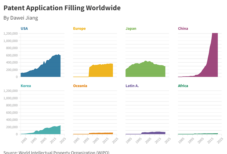
This is called grid view. By separating 8 entities on a timeline and scale, the aggregational information of the data can be extracted.

This is an improved grid view. It has two scales and can be used to highlight the main focus entity, in this case, the United States, which is presented in line format.

Plot the lines together, you get this. This graph helps viewers to see the growth and comparison in a more visual way.
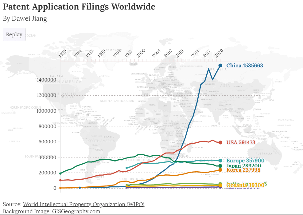
This is for the ultimate visualization. The data is now dynamically displayed, with fine touches and fine details. You can view the story at: https://public.flourish.studio/story/1793664/
In my LinkedIn post, I stated that if data is gold, data visualization is goldsmithing. It transforms useful materials into beautiful artifacts.
